Why the PGA’s New Logo Is Dividing Golf Professionals
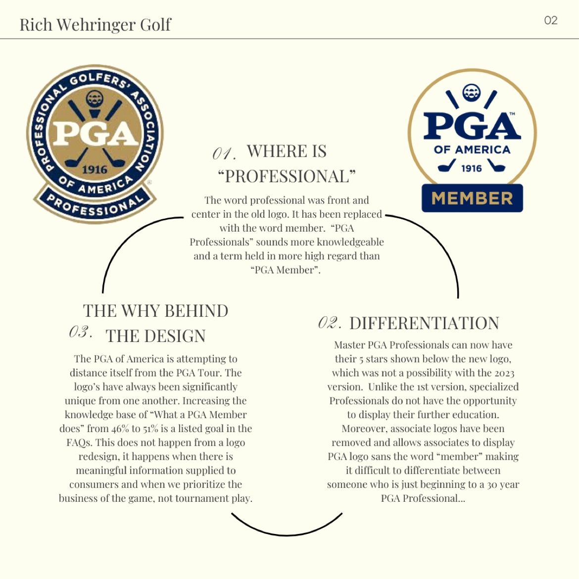
In 2023, the PGA of America rolled out a refreshed logo and brand identity aimed at modernizing the organization’s image and better distinguishing it from the similarly named PGA Tour. The new design features a simplified, digital-friendly wordmark that emphasizes “PGA” with “of America” clearly noted beneath it, along with imagery designed to signal both heritage and accessibility for a broader audience. The accompanying “We Love This Game” marketing campaign was positioned as a way to connect with new golfers and fans in an increasingly digital world.
Supporters of the logo change argue the update was necessary for the organization’s future relevance, particularly as the sports world evolves and younger audiences consume branding differently. According to Sports Business Journal, Jeff Price, Chief Commercial Officer of the PGA of America, explained the reasoning behind the redesign, saying, “We have a functional challenge that we’re trying to solve with a modern, simplified design. The ‘of America’ component as our differentiator is really important, and it’s most times just not legible to the consumer.” This emphasis on clarity was intended to reduce the long-standing confusion between the PGA of America — which represents professionals who teach and grow the game — and the PGA Tour, which is known primarily for its elite weekly tournaments.
From the perspective of some PGA professionals, the rebrand offered an opportunity to refocus the organization’s identity on its mission. “Highlighting the word professional is important to me,” said Richard Wehringer, a PGA professional in a public LinkedIn discussion of the changes. He added that emphasizing expertise in the brand could help differentiate PGA of America golf professionals from other parts of the golf industry. “We are marketed as experts in the game,” Wehringer said, arguing that the updated visual identity opens conversations about the role PGA members play at the grassroots level.
Even within the community that supports rebranding efforts, there are nuanced views about whether the new logo alone is sufficient. Mark Anderson, another PGA professional, acknowledged on the linkedIn debate openly, noting that while a refreshed logo might seem like a step forward, discussions about its effectiveness would likely continue. “Many golf professionals who are in the trenches daily disagree,” Anderson observed, highlighting that some feel the older logo had stronger impact in print and traditional applications. “Our older logo was unique and its design eyecatching.” His statement reflects a desire among some members to maintain aspects of tradition even while adapting for modern use.
Critics of the redesign have also voiced skepticism about the value of changing a longstanding emblem tied closely to golf tradition. Some observers in the golf community have questioned whether a new logo — even one tied to an updated marketing strategy — truly addresses the deeper challenges facing the sport, such as declining participation in some demographics or competition with other golf tours. Social media threads and informal discussions have pointed to a belief among traditionalists that the identity and heritage of golf carry value that can be diluted with visual changes. While not all of these views come from industry leaders, they illustrate a significant and vocal segment of golfers who feel branding adjustments should be approached with caution.
Despite the mixed reactions, the PGA of America maintains that the logo and brand campaign will help clarify its mission and broaden its appeal. By accentuating the association’s founding year and highlighting its unique role separate from the PGA Tour, the organization believes it can strengthen connections with both existing golf professionals and new golfers entering the sport. Whether this strategy succeeds in uniting the broader golf community under a refreshed visual identity remains a topic of ongoing conversation among professionals and fans alike.